How to create a chart with conditional formatting in Excel?
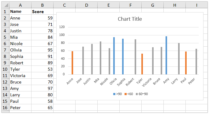
For example, you have a score table of a class, and you want to create a chart to color scores in different ranges, such as greater than 90, less than 60, and between 60 and 90 as below screenshot shown, how could you handle it? This article will introduce a way to create chart with conditional formatting to solve it.
- Create a chart with conditional formatting in Excel
- Create a chart with conditional formatting by an amazing tool
- Conditional formatting an existing chart
Create a chart with conditional formatting in Excel
To distinguish scores in different ranges in a chart, you can create the chart with conditional formatting in Excel.
1. Add three columns right to the source data as below screenshot shown:
(1) Name the first column as >90, type the formula =IF(B2>90,B2,0) in the first blank cell of this column, and then drag the AutoFill Handle to the whole column;
(2) Name the second column as <60, type the formula =IF(B2<60,B2,0), and drag the AutoFill Handle to the whole column;
(3) Name the third column as 60~90, type the formula =IF(AND(B2>=60,B2<=90),B2,0), and drag the AutoFill Handle to the whole column.

Now you will get a new source data as below screenshot shown:

2. Please select the Name column and the new three columns with holding the Ctrl key, and then click Insert > Insert Column or Bar Chart (or Column) > Clustered Column. See screenshot:

Now a chart with conditional formatting is created. You will see the scores greater than 90 are blue, the scores less than 60 are orange, while the scores between 60 and 90 are gray. See screenshot:

Create a chart with conditional formatting by an amazing tool
If you have Kutools for Excel installed, you can use its Color Grouping Chart feature to quickly create a chart with conditional formatting in Excel.
1. Select the data source you will create the chart based on, and click Kutools > Charts > Color Grouping Chart to enable this feature.
2. In the Color Grouping Chart, please do as follows:

(1) Tick the Column Chart option;
(2) Specify the range of the axis labels;
(3) Specify the range of the series values;
(4) In the Group section, please click the Add button. Then in the Add a group dialog, please specify the group name, data range, and the certain range values as you need, and click the Add button.
Tips: This feature will add a conditional formatting rule by one group. If you need to add multiple conditional formatting rules for the chart, please add as many groups as you need.
3. Click the Ok button.
Now you will see a column chart is created, and columns are colored based on the specified groups.

Notes: When you change the values in the data source, the fill color of corresponding columns will be changed automatically based on the specified groups.
Conditional formatting an existing chart
Sometimes, you may have created a column chart as below screenshot shown, and you want to add conditional formatting for this chart now. Here, I will recommend the Color Chart by Value feature of Kutools for Excel to solve this problem.

1. Select the chart you want to add conditional formatting for, and click Kutools > Charts > Color Chart by Value to enable this feature.
2. In the Fill chart color based on dialog, please do as follows:
(1) Select a range criteria from the Data drop-down list;
(2) Specify the range values in the Min Value or Max Value boxes;
(3) Choose a fill color from the Fill Color drop-down list;
(4) Click the Fill button.

Tips:
(1) The (1)-(4) operations will change the fill color of columns whose data point values fall in the specified data range.
(2) If you want to change the fill color of other columns, you need to repeat (1)-(4) operations to create other rules, says change the fill color of columns whose data point values are between 60 and 90 to gray.

3. After finishing the operations, please click the Close button to quit the feature.
Notes: This method will solidly change the fill color of columns in the chart. If you change the values in the source data, the corresponding columns’ fill colors will not be changed.
Related articles:
Best Office Productivity Tools
Supercharge Your Excel Skills with Kutools for Excel, and Experience Efficiency Like Never Before. Kutools for Excel Offers Over 300 Advanced Features to Boost Productivity and Save Time. Click Here to Get The Feature You Need The Most...
Office Tab Brings Tabbed interface to Office, and Make Your Work Much Easier
- Enable tabbed editing and reading in Word, Excel, PowerPoint, Publisher, Access, Visio and Project.
- Open and create multiple documents in new tabs of the same window, rather than in new windows.
- Increases your productivity by 50%, and reduces hundreds of mouse clicks for you every day!