How to create a chart with both percentage and value in Excel?
It is easy to add either percentages or values to a bar or column chart. However, have you ever tried creating a chart that displays both percentages and values simultaneously in Excel?
Create a chart with both percentage and value in Excel
Create a stacked chart with percentage by using a powerful feature
Create a chart with both percentage and value in Excel
To accomplish this in Excel, follow these steps:
1. Select the data range that you want to create a chart but exclude the percentage column, and then click Insert > Insert Column or Bar Chart > 2-D Clustered Column Chart, see screenshot:

2. After inserting the chart, then, you should insert two helper columns, in the first helper column-Column D, please enter this formula: =B2*1.15, and then drag the fill handle down to the cells, see screenshot:

3. And then, in the second helper column, Column E, enter this formula: =B2&CHAR(10)&" ("&TEXT(C2,"0%")&")", and drag the fill handle down to the cells that you want to use, see screenshot:

4. Next, select the chart, right-click it, and choose Select Data from the context menu, see screenshot:

5. In the Select Data Source dialog box, click Add button, see screenshot:

6. And then, under the Series values section, select the data in the first helper column, see screenshot:

7. Then, click OK button, this new data series has been inserted into the chart, and then, please right click the new inserted bar, and choose Format Data Series, see screenshot:

8. In the Format Data Series pane, under the Series Options tab, select Secondary Axis from the Plot Series On section. The resulting chart will look like the screenshot below:

9. Then, right click the chart, and choose Select Data, in the Select Data Source dialog box, click the Series2 option from the left list box, and then click Edit button, see screenshot:

10. And in the Axis Labels dialog, select the second helper column data, see screenshot:

11. Click OK button, then, go on right click the bar in the char, and choose Add Data Labels > Add Data Labels, see screenshot:

12. And the values have been added into the chart as following screenshot shown:

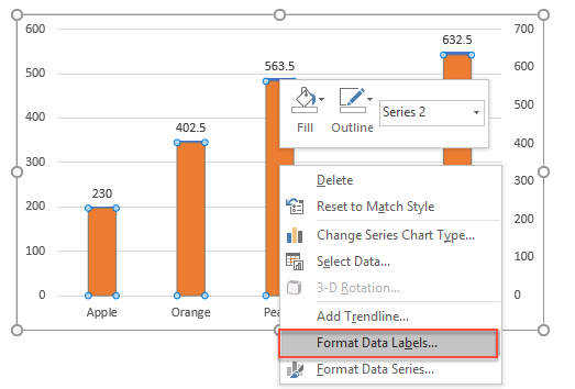
13. Then, please go on right click the bar, and select Format Data Labels option, see screenshot:
14. In the Format Data Labels pane, please check Category Name option, and uncheck Value option from the Label Options, and then, you will get all percentages and values are displayed in the chart, see screenshot:

15. In this step, remove the color from the helper column data series. Select the data series bar, then go to the Format tab and click Shape Fill > No Fill, as shown in the screenshot:

16. At last, right click the secondary axis, and choose Format Axis option from the context menu, see screenshot:

17. In the Format Axis pane, select None options from the Major type, Minor type and Label Position drop down list separately, see screenshot:

Create a stacked chart with percentage by using a powerful feature
Sometimes, you may want to create a stacked chart with percentages. In such cases, Kutools for Excel provides an excellent feature called Stacked Chart with Percentage, allowing you to create a stacked chart with percentages in just a few clicks, as shown in the demo below.

1. Click Kutools > Charts > Category Comparison > Stacked Chart with Percentage, see screenshot:

2. In the Stacked column chart with percentage dialog box, specify the data range, axis labels and legend series from the original data range separately, see screenshot:

3. Then click OK button, and a prompt message is popped out to remind you some intermediate data will be created as well, simply click the Yes button, see screenshot:

4. And then, a stacked column chart with percentage has been created at once, see screenshot:

Kutools for Excel - Supercharge Excel with over 300 essential tools. Enjoy permanently free AI features! Get It Now
More relative chart articles:
- Create A Bar Chart Overlaying Another Bar Chart In Excel
- When we create a clustered bar or column chart with two data series, the two data series bars will be shown side by side. But, sometimes, we need to use the overlay or overlapped bar chart to compare the two data series more clearly. In this article, I will talk about how to create an overlapped bar chart in Excel.
- Create A Step Chart In Excel
- A step chart is used to show the changes happened at irregular intervals, it is an extended version of a line chart. But, there is no direct way to create it in Excel. This article, I will talk about how to create a step chart step by step in Excel worksheet.
- Highlight Max And Min Data Points In A Chart
- If you have a column chart which you want to highlight the highest or smallest data points with different colors to outstand them as following screenshot shown. How could you identify the highest and smallest values and then highlight the data points in the chart quickly?
- Create A Bell Curve Chart Template In Excel
- Bell curve chart, named as normal probability distributions in Statistics, is usually made to show the probable events, and the top of the bell curve indicates the most probable event. In this article, I will guide you to create a bell curve chart with your own data, and save the workbook as a template in Excel.
- Create Bubble Chart With Multiple Series In Excel
- As we know, to quickly create a bubble chart, you will create all the series as one series as screenshot 1 shown, but now I will tell you how to create a bubble chart with multiple series as screenshot 2 shown in Excel.
Best Office Productivity Tools
Supercharge Your Excel Skills with Kutools for Excel, and Experience Efficiency Like Never Before. Kutools for Excel Offers Over 300 Advanced Features to Boost Productivity and Save Time. Click Here to Get The Feature You Need The Most...
Office Tab Brings Tabbed interface to Office, and Make Your Work Much Easier
- Enable tabbed editing and reading in Word, Excel, PowerPoint, Publisher, Access, Visio and Project.
- Open and create multiple documents in new tabs of the same window, rather than in new windows.
- Increases your productivity by 50%, and reduces hundreds of mouse clicks for you every day!